
Page 48 - Read Online
P. 48
Nakamoto et al. Plast Aesthet Res 2024;11:54 https://dx.doi.org/10.20517/2347-9264.2024.82 Page 11 of 14
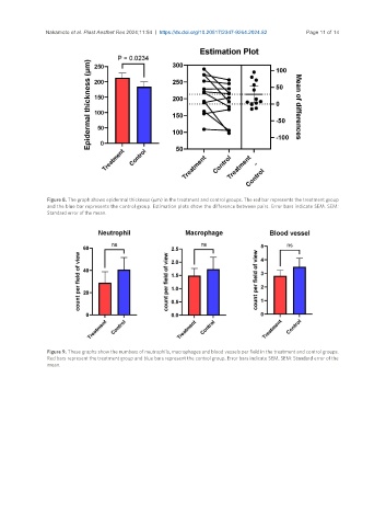
Figure 8. The graph shows epidermal thickness (µm) in the treatment and control groups. The red bar represents the treatment group
and the blue bar represents the control group. Estimation plots show the difference between pairs. Error bars indicate SEM. SEM:
Standard error of the mean.
Figure 9. These graphs show the numbers of neutrophils, macrophages and blood vessels per field in the treatment and control groups.
Red bars represent the treatment group and blue bars represent the control group. Error bars indicate SEM. SEM: Standard error of the
mean.