
Page 13 - Read Online
P. 13
Sathyan et al. Complex Eng Syst 2022;2:18 I http://dx.doi.org/10.20517/ces.2022.41 Page 9 of 12
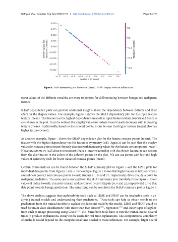
Figure 6. SHAP dependency plot for texture (mean). SHAP: Shapley Additive exPlanations.
worst values of the different variables are more important for differentiating between benign and malignant
masses.
SHAP dependency plots can provide additional insights about the dependency between features and their
effect on the shapley values. For example, Figure 6 shows the SHAP dependency plot for the input feature
texture (mean). This feature has the highest dependency on another input feature texture (worst) and hence is
also shown in the plot. It can be noticed that shapley values for texture mean linearly decreases with increasing
texture (mean). Additionally, based on the colored points, it can be seen that higher texture (mean) also has
higher texture (worst).
As another example, Figure 7 shows the SHAP dependency plot for the feature concave points (mean). The
feature with the highest dependency on this feature is symmetry (std). Again, it can be seen that the shapley
valuesforconcavepoints(mean)linearlydecreasewithincreasingvaluesforthefeatureconcavepoints(mean).
However, symmetry (std) does not necessarily have a linear relationship with the chosen feature, as can be seen
from the distribution in the colors of the different points on the plot. We can see points with low and high
values of symmetry (std) for lower values of concave points (mean).
Certain commonalities can be found between the SHAP summary plot in Figure 5 and the LIME plots for
individual data points from Figures 3 and 4. For example, Figure 3 shows that higher values of texture (worst),
smoothness (worst) and concave points (worst) (inputs 21, 24 and 27, respectively) drive that data point to
malignant prediction. The same can be noticed from the SHAP summary plot. Similarly, from Figure 4, lower
values of radius (worst), concavity (mean) and perimeter (worst) (inputs 20, 6 and 22, respectively) drive that
data point towards benign prediction. The same trend can be seen from the SHAP summary plot in Figure 5.
The above analysis suggests that explainability tools such as LIME and SHAP can be invaluable tools in an-
alyzing trained models and understanding their predictions. These tools can help us obtain trends in the
predictions from the trained models to explain the decisions made by the model. LIME and SHAP could be
used for multi-class classification (with more than two classes) [31] , regression [32] and other types of applica-
tions such as image processing using CNNs [33] , etc. Since both tools have to run the trained model several
times to produce explanations, it may not be useful for real-time explanations. The computational complexity
of methods would depend on the computational time needed to make inferences. For example, larger neural