
Page 12 - Read Online
P. 12
Page 8 of 12 Sathyan et al. Complex Eng Syst 2022;2:18 I http://dx.doi.org/10.20517/ces.2022.41
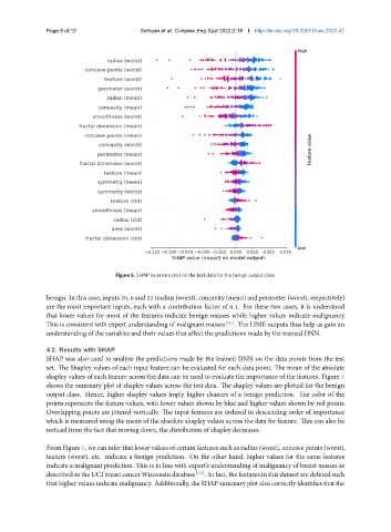
Figure 5. SHAP summary plot on the test data for the benign output class
benign. In this case, inputs 20, 6 and 22 (radius (worst), concavity (mean) and perimeter (worst), respectively)
are the most important inputs, each with a contribution factor of 0.1. For these two cases, it is understood
that lower values for most of the features indicate benign masses while higher values indicate malignancy.
This is consistent with expert understanding of malignant masses [30] . The LIME outputs thus help us gain an
understanding of the variables and their values that affect the predictions made by the trained DNN.
4.2. Results with SHAP
SHAP was also used to analyze the predictions made by the trained DNN on the data points from the test
set. The Shapley values of each input feature can be evaluated for each data point. The mean of the absolute
shapley values of each feature across the data can be used to evaluate the importance of the features. Figure 5
shows the summary plot of shapley values across the test data. The shapley values are plotted for the benign
output class. Hence, higher shapley values imply higher chances of a benign prediction. The color of the
points represents the feature values, with lower values shown by blue and higher values shown by red points.
Overlapping points are jittered vertically. The input features are ordered in descending order of importance
which is measured using the mean of the absolute shapley values across the data for feature. This can also be
noticed from the fact that moving down, the distribution of shapley decreases.
From Figure 5, we can infer that lower values of certain features such as radius (worst), concave points (worst),
texture (worst), etc. indicate a benign prediction. On the other hand, higher values for the same features
indicate a malignant prediction. This is in line with expert’s understanding of malignancy of breast masses as
described in the UCI breast cancer Wisconsin database [30] . In fact, the features in this dataset are defined such
that higher values indicate malignancy. Additionally, the SHAP summary plot also correctly identifies that the